Luxury & Premium Look in Print Design
Clients often describe the persona they want their brand to embody with words like ‘Luxury’ and ‘Premium.’ Yet few truly understand what these terms mean in print design. Luxury and premium print go far beyond gold or silver gradients.
Dona Nirasha Kannangara
3/4/20263 min read
“Luxury” and “Premium” are two terms I hear often from clients when describing the persona they want their brand to embody. Once the initial branding phase, logo and identity are complete, the brand expression phase begins. This is where things can get both exciting and confusing. Even with mood boards set at the start, I’ve noticed clients sometimes shift toward visual directions that don’t align, especially in print projects.
I guess this often happens because exposure to luxury design is limited, and these terms themselves mean different things to different people. Yet, if we look at established luxury brands, there’s a clear consensus: they follow common rules; restraint, minimal palettes, and tactile finishes that elevate the experience.
If we take a closer look, the following are the several key characteristics and print production considerations that consistently define this type of print design.
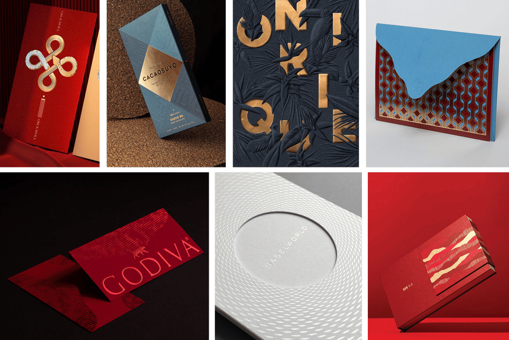
Key Principles of Luxury Print Design
Whether you’re working on stationery, packaging, or invitations, these elements consistently signal refinement:
Minimalist Layouts: Clean spacing, balanced typography, and uncluttered compositions.
Elegant Typography: Serif fonts, custom lettering, or high‑contrast pairings that convey sophistication.
Colour Palettes: Rich, deep tones (emerald, navy, burgundy, black) often paired with metallics (gold, silver, copper). White and light neutrals (ivory, cream, soft grey) are used tastefully with embossing, foil, or textured paper to create purity and understated elegance.
Production & Printing Considerations
Think carefully about:
Paper thickness: Paper thickness plays a vital role in perception; heavyweight stock conveys substance, while in certain scenarios, thinner or even translucent papers are chosen to express delicacy, lightness, or modernity
Texture: Smooth vs. textured, depending on the requirement
Finish: Matte, metallic, halo, or soft‑touch laminates
Printing techniques: Foil stamping, embossing/debossing, spot UV, letterpress, all add dimension and elevate the brand persona
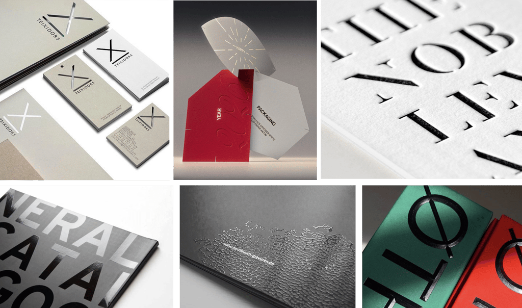
Let’s explore some of the most commonly used print production techniques.
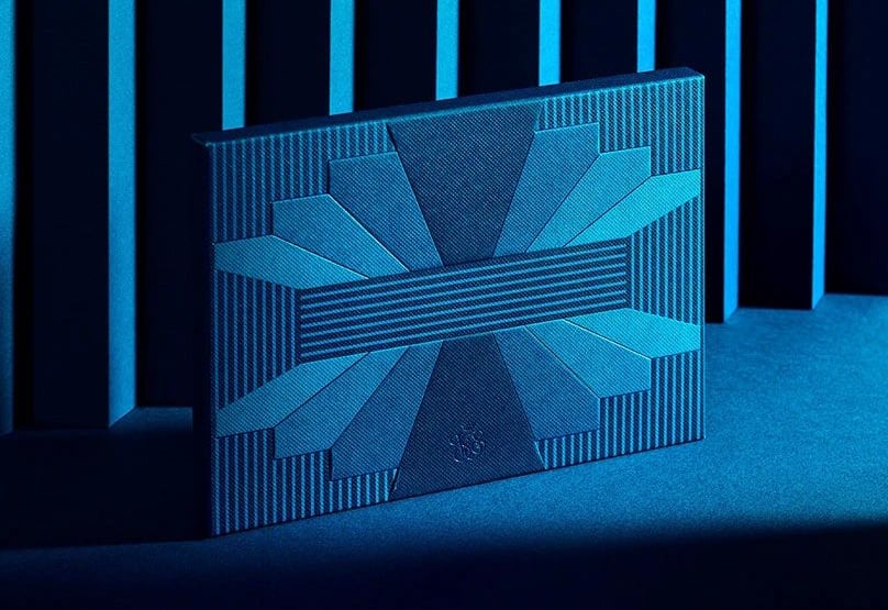
Embossing and debossing
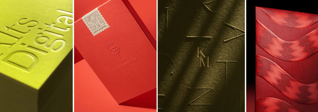
Foiling
Holographic foil stamping
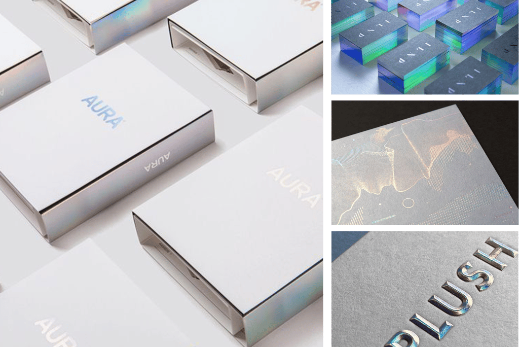
Mix of techniques: Cutouts, letterpress, spot varnishing
This is only a brief introduction to a wide subject. It takes a trained eye and years of experience to know which technique to choose and how to apply it tastefully. It’s up to both designers and business owners to research further and understand the full range of possibilities available in print production.
Final Thoughts
If you’re a business owner looking to elevate your brand across physical touchpoints, start by asking:
Which brands feel premium to me, and what techniques have they used?
Then, trust your designer’s expertise. With years of experience, they understand how to translate those cues into print and remember that many print designs only reveal their true impact once they come out of production.
Ultimately, luxury/premium print design is about restraint, material quality, and thoughtful execution.
(P.S. Images featured here are the copyright of their respective creators and businesses. They are used here solely for educational and illustrative purposes.)
Designed by Violaine & Jeremy in Paris, France (https://www.violaineetjeremy.fr/)