design work
Client:
HSBC Commercial and Global Banking
Audience:
HSBC Vietnam high-net clients
My role:
Lead Digital Designer for the project (Worked on the concepts and final graphic creation)
Team:
Gehan Dharmasiri (Art Director), Anil Hemantha (Art Director), Thanura Dalugoda (Supporting Digital Designer)
Job brief: The Regional Marketing Manager for CMB and GBM reached HSBC Digital Production Services on design support for high-net-worth clients' events in Ho Chi Minh and Ha Noi as part of a series of client appreciation events. These events are considered exclusive, and the request included creating key visuals such as an Iconic Hexagon for the main event backdrop, email banner, event banner and Zoom background. I had the privilege of driving the project forward under the guidance of two art directors.
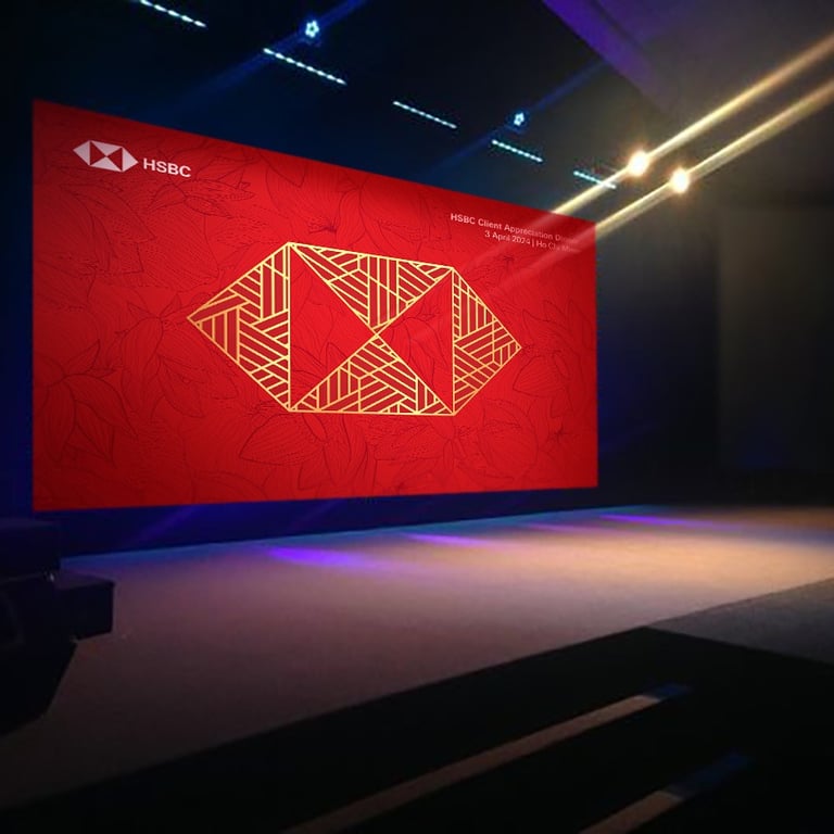
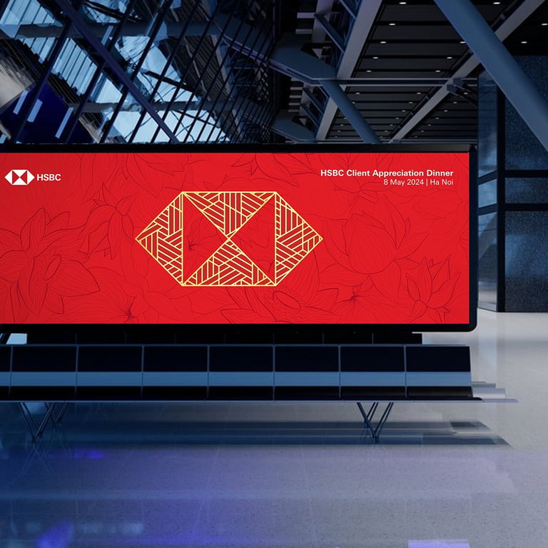
Design process: The HSBC hexagon is not just a logo; it is a versatile symbol used in various aspects of HSBC's communications. There are three versions of the hexagon: the Iconic Hexagon, the Open Hexagon, and the Cropped Hexagon. Each version is used to ensure brand consistency while allowing for creative flexibility. For this particular design, we needed an Iconic Hexagon, which is an important element in the brand development model. Creating an Iconic Hexagon is challenging due to the strict guidelines associated with it.
The client provided us with some references and a preferred theme that represents celebration and festivity. We were uncertain about how closely we could match the client's references because this is a public event that required Group brand approval before publication. The design process began with extensive research on Vietnamese culture, traditions, artefacts, and symbols to complement the key visual. In the initial design phase, I had numerous brainstorming sessions with the team and explored various design options. Ultimately, we decided on the lotus as Vietnam's national flower, representing purity, dedication, and the optimism HSBC holds for its client's future.
The final visuals were created using primary red shades from the HSBC colour palette, with a gold hexagon positioned in the centre. The design is complemented by a delicate floral pattern in the background. Throughout the process, we received positive feedback from the Group brand, and I ultimately created visuals that satisfied the client and met the brand requirements.
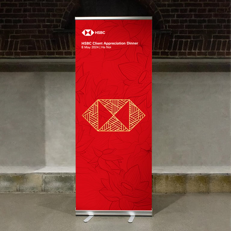
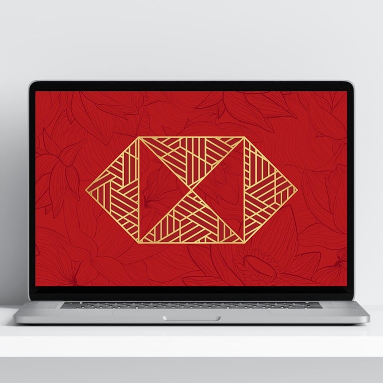
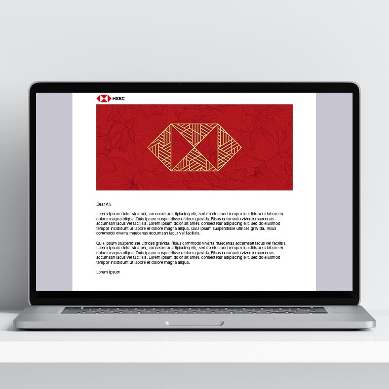
HSBC - Vietnam Client appreciation event
Sobaavi branding
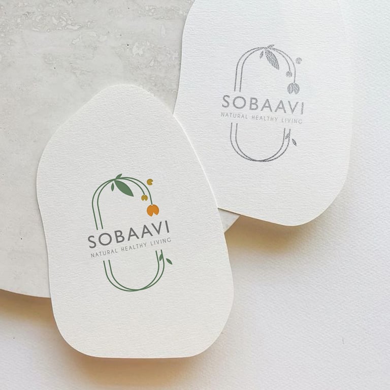
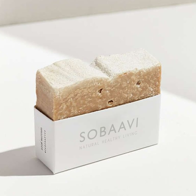

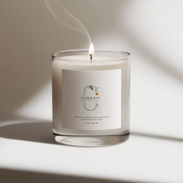

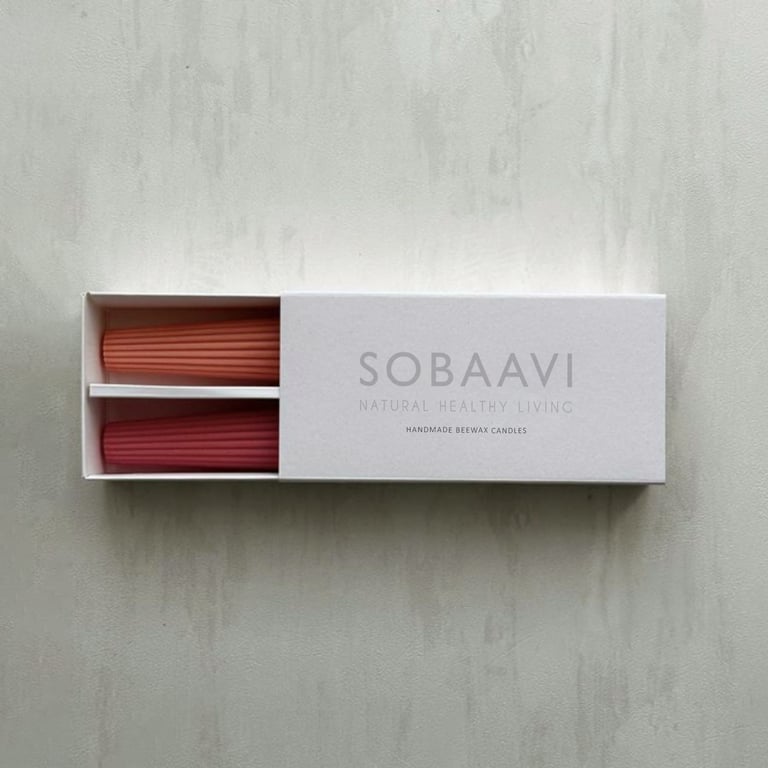
Client : Sobaavi
My Role: Art Director and Designer (As the sole designer and art director for this project, I was responsible for conceptualizing and executing the entire brand identity.)
Project Overview: Sobaavi is a small-scale, homemade brand dedicated to creating all-natural products, ranging from bath powders and cosmetics to candles, incense sticks, healthy snacks, and more. The brand’s mission is to offer natural, eco-friendly products that promote well-being and sustainability.
Design Concept: For Sobaavi, I aimed to create a brand identity that reflects its commitment to nature and simplicity. The design elements were inspired by the natural world, ensuring that the brand’s visual identity aligns with its core values.
Deliverables
Logo Design: Developed a logo that embodies the essence of Sobaavi’s natural and homemade ethos
Colour Palette: Selected hues from nature to create a soothing and organic colour palette that resonates with the brand’s mission.
Typography: Chose fonts that are clean, readable, and complement the natural aesthetic of the brand
Packaging Design: Considering the scale of the business I made sure the packaging design could be implemented at a low cost without compromising on quality or aesthetics
Social Media Campaign: For Sobaavi’s social media, I developed a series of visually appealing posts that highlight the brand’s natural products. Each month featured carefully crafted visuals and engaging content to attract and retain followers
Outcome: The branding project for Sobaavi successfully captured the brand’s dedication to natural and eco-friendly products. The cohesive visual identity, from the logo to the packaging and social media campaign, effectively communicates Sobaavi’s mission and appeals to its target audience.
Check my Behance profile for more details on this project.
Perigee Construction Branding Project
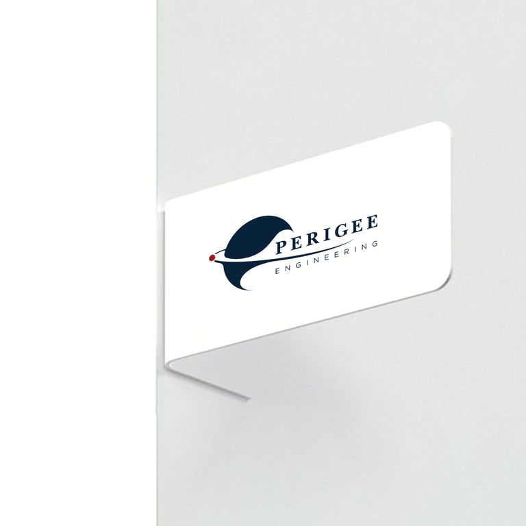
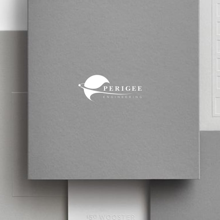
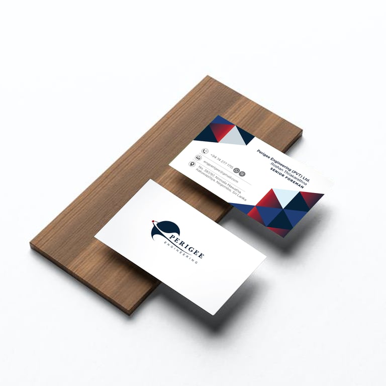
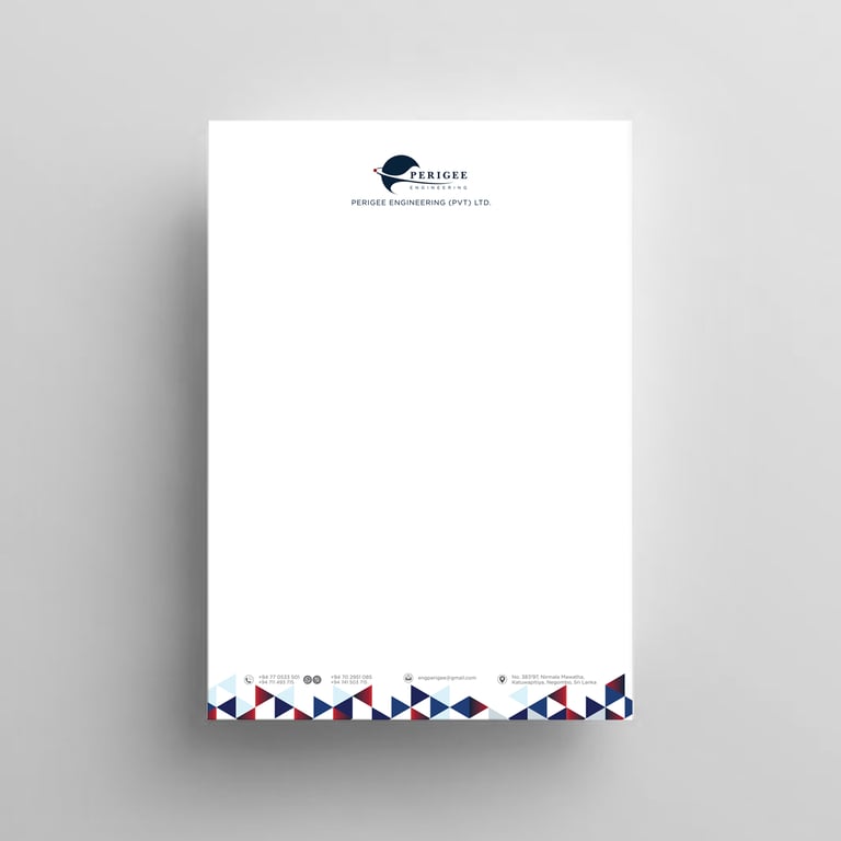
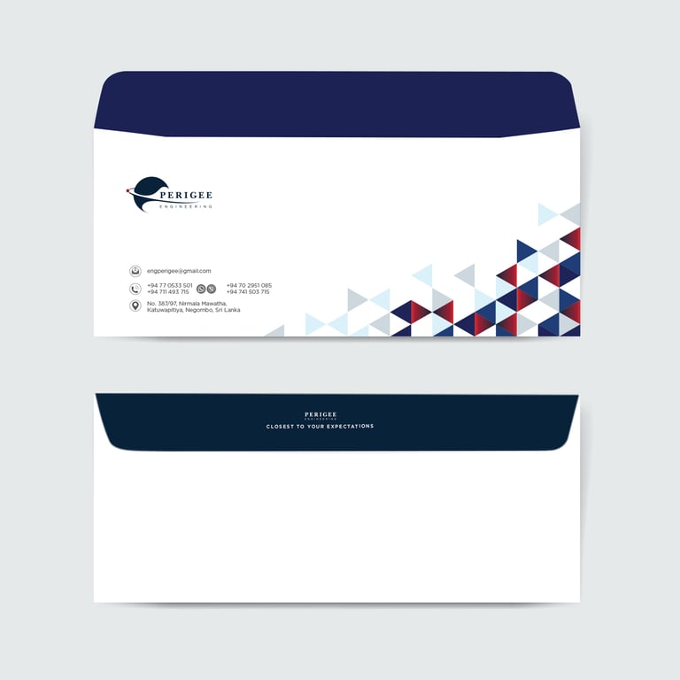
Client : Perigee construction
My role: Art Director and Designer (As the sole designer and art director for the Perigee Construction branding project, I was responsible for conceptualizing and executing the entire brand identity.)
Project Overview: Perigee Construction approached me with a unique branding challenge. The company name, “Perigee,” refers to the point in the orbit of an object orbiting the Earth that is nearest to the centre of the Earth. This concept of proximity and closeness was central to the brand identity we aimed to create.
Design Concept: Drawing inspiration from the meaning of “Perigee,” I designed a logo that symbolizes the closest point of connection, reflecting the company’s commitment to building strong, reliable structures that stand the test of time. The logo integrates elements that evoke stability and precision, essential qualities in the construction industry.
Deliverables
Logo Design: A visually compelling logo encapsulates the essence of “Perigee” and its significance in construction
Colour Palette: A cohesive set of colours that convey trust, strength, and professionalism
Typography: Carefully selected fonts that enhance readability and brand recognition
Business Card: Professionally designed business cards that leave a lasting impression
Letterhead: Elegant letterhead designs for official correspondence
Envelopes: Custom envelopes that align with the overall brand aesthetic
Company Profile: A comprehensive company profile that showcases Perigee Construction’s expertise and services
Outcome: The branding project for Perigee Construction successfully translated the unique concept of “Perigee” into a strong visual identity. The cohesive brand elements not only reflect the company’s core values but also enhance its professional image in the construction industry.
Client: FJL Limited
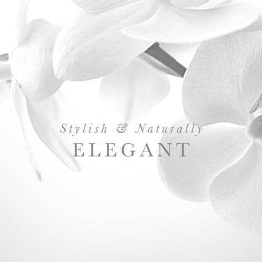
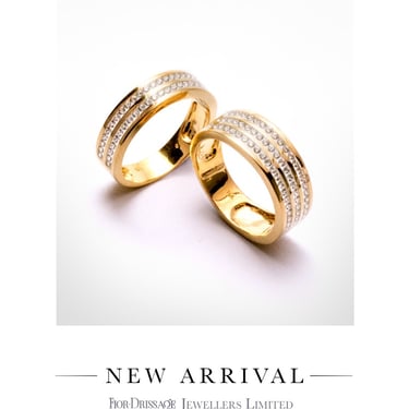
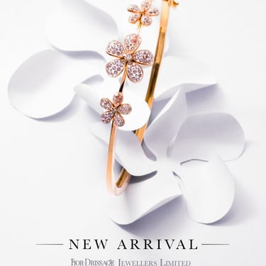
Project Overview: For this project, I managed the social media account of a prestigious diamond jeweller, creating a unique concept and campaign for each month. The featured lineup for this particular month showcased a stunning collection of floral jewellery studded with tiny diamonds.
Design Concept: The campaign’s visuals were inspired by the intricate beauty of flowers, mirroring the delicate craftsmanship of the jewellery pieces. Each piece was photographed against a pristine white background, complemented by hand-cut paper flowers that matched the floral designs in the jewellery. These paper cuts were meticulously prepared by me to ensure a cohesive and elegant presentation.
Challenges
In the course of our project, we encountered several challenges that required thoughtful navigation:
Limited Budget: Working within a tight budget posed constraints on our ability to acquire props for the photoshoot. This prompted us to employ creative problem-solving to produce high-quality visuals with limited resources.
Client Education: Our client had limited experience in social media marketing, necessitating comprehensive education and guidance to align their expectations and understanding with the campaign’s objectives.
Account Issues: The client's social media accounts faced login challenges due to multiple handlers in the past. It was imperative to address these issues to ensure seamless campaign execution.
Learning Curve: I undertook a rapid familiarization process with social media marketing terminologies and strategies to develop an effective campaign.
Internal Friction: At times, there were interpersonal challenges with certain employees on the client's side, which demanded careful management and communication to safeguard the success of our project.
Role and Responsibilities
Concept Development: Created the overarching theme and visual concept for the campaign
Art Direction: Directed the photoshoot, ensuring that it brings my concept to life
Post-Production: Edited and enhanced the images to highlight the intricate details of the jewellery
Graphic Creation: Designed the final graphics for social media posts
Team Management: Coordinated with the photographer and copywriter to bring the concept to life
Client Communication: Maintained regular communication with the client to ensure their vision was met
Social Media Strategy: Developed and implemented a comprehensive social media marketing strategy
Post Scheduling and Boosting: Managed the posting schedule and boosted posts to maximize reach and engagement
Reporting: Generated detailed month-end reports to track the campaign’s performance and provide insights to the client
Team
Photography: Rajarathnam Rajeevan
Copy: Lahiru Fernando
Outcome: The campaign successfully highlighted the jeweller’s exquisite floral collection, engaging the audience with visually captivating content. The strategic approach to social media marketing resulted in increased brand visibility and customer engagement.











FDJ - social media campaign
Client: FJL Limited
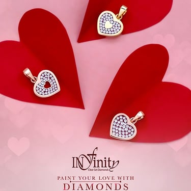
Project Overview: This project involved overseeing the social media presence of a well-known diamond jeweler, devising a unique concept and campaign for each month. The spotlight for this particular month was on showcasing a romantic Valentine collection, featuring exquisite jewelry pieces ideal for the occasion.
Design Concept: The campaign's visuals drew inspiration from the theme of love and romance. Each piece was photographed against a pristine red backdrop, with red paper hand-cuts and folds that harmonized with the jewelry.
Challenges
In the course of our project, we encountered several challenges that required thoughtful navigation:
Limited Budget: Working within a tight budget posed constraints on our ability to acquire props for the photoshoot. This prompted us to employ creative problem-solving to produce high-quality visuals with limited resources.
Client Education: Our client had limited experience in social media marketing, necessitating comprehensive education and guidance to align their expectations and understanding with the campaign’s objectives.
Account Issues: The client's social media accounts faced login challenges due to multiple handlers in the past. It was imperative to address these issues to ensure seamless campaign execution.
Learning Curve: I undertook a rapid familiarization process with social media marketing terminologies and strategies to develop an effective campaign.
Internal Friction: At times, there were interpersonal challenges with certain employees on the client's side, which demanded careful management and communication to safeguard the success of our project.
Role and Responsibilities
Concept Development: Created the overarching theme and visual concept for the campaign
Art Direction: Directed the photoshoot, ensuring that it brings my concept to life
Post-Production: Edited and enhanced the images to highlight the intricate details of the jewellery
Graphic Creation: Designed the final graphics for social media posts
Team Management: Coordinated with the photographer and copywriter to bring the concept to life
Client Communication: Maintained regular communication with the client to ensure their vision was met
Social Media Strategy: Developed and implemented a comprehensive social media marketing strategy
Post Scheduling and Boosting: Managed the posting schedule and boosted posts to maximize reach and engagement
Reporting: Generated detailed month-end reports to track the campaign’s performance and provide insights to the client
Team
Photography: Rajarathnam Rajeevan
Copy: Lahiru Fernando
Outcome: The Valentine campaign effectively showcased the jeweler's romantic collection, captivating the audience with visually engaging content. The strategic approach to social media marketing led to heightened brand visibility and increased customer engagement.
