Brand systems built on reasoning, not instinct.
I build brand identities grounded in research, strategy, and deliberate craft, so your business communicates value before anyone reads a word.
Building brands through timeless visual narratives.
The Process
Most branding work starts with aesthetics.
Mine starts with questions.
Before a single mark is drawn, I need to understand your business, your market position, your competitors, your audience, and what you're actually trying to communicate.
The visual work comes after that thinking is done. Not before.


From early-stage companies establishing authority on day one to established corporations re-grounding their identity, the method is consistent: strategy first, aesthetics second.
Identities built to function
across decades
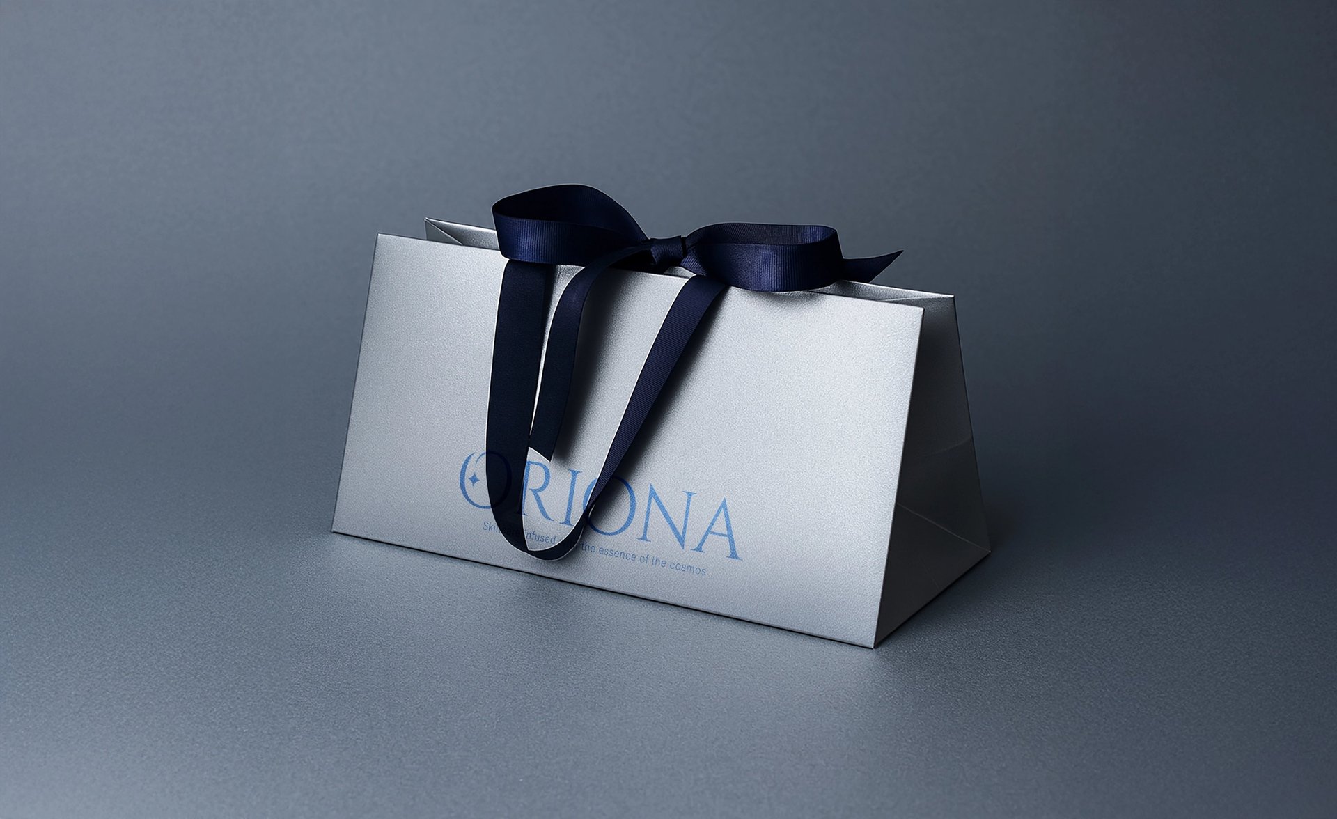
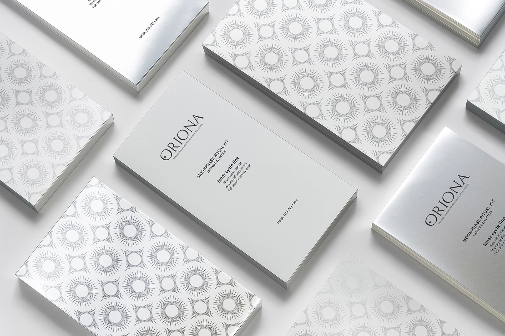
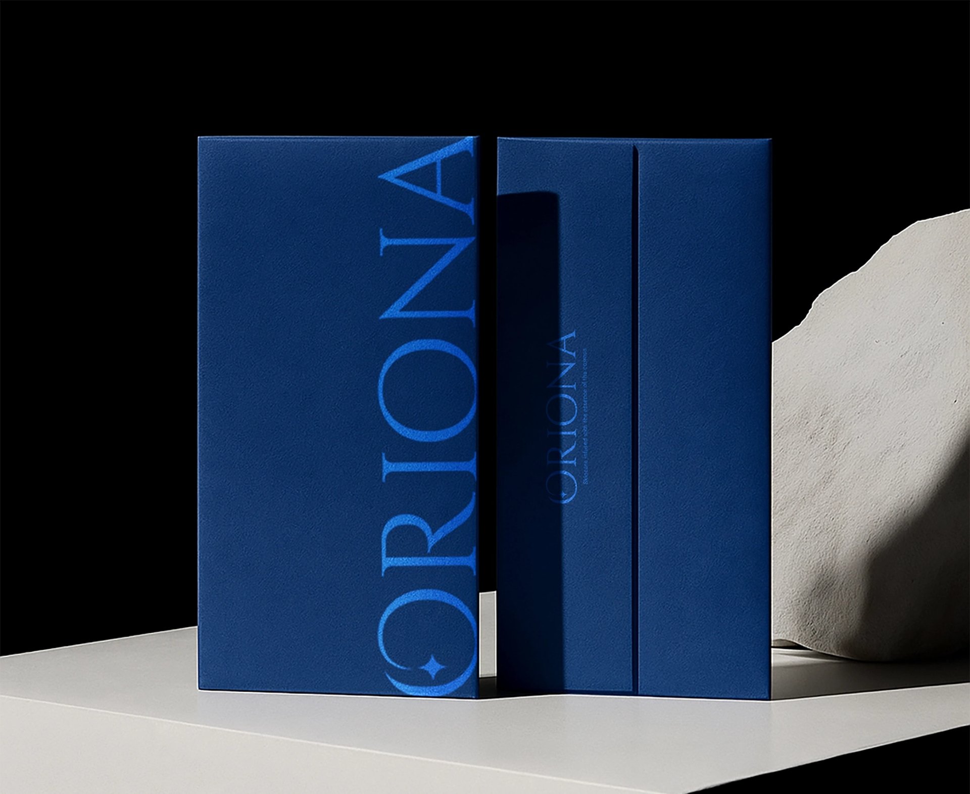
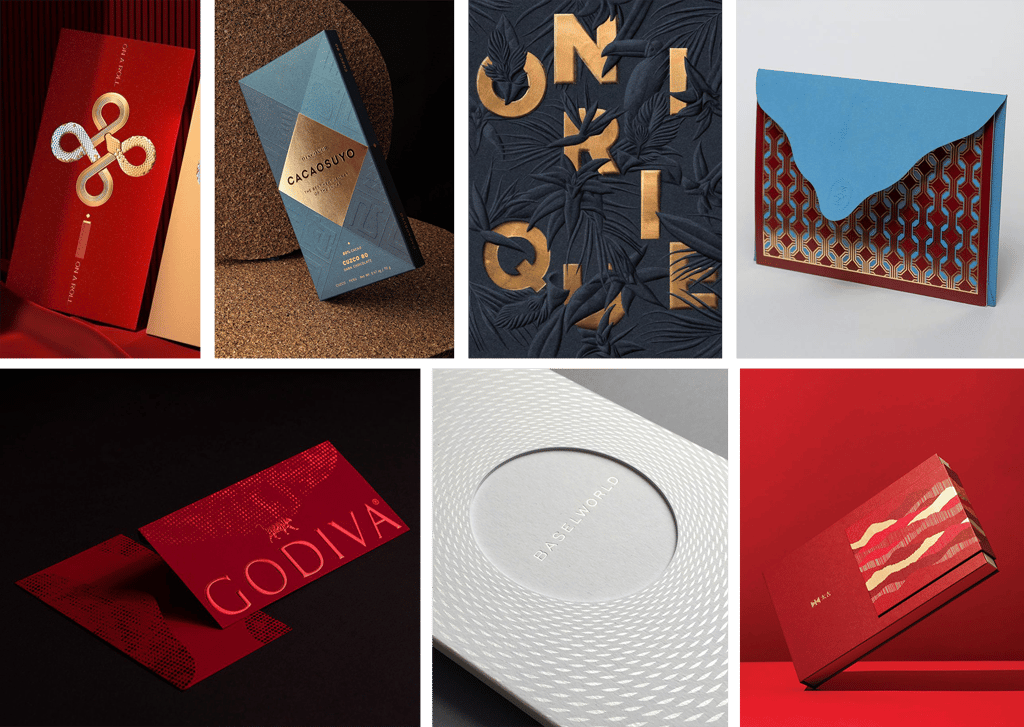
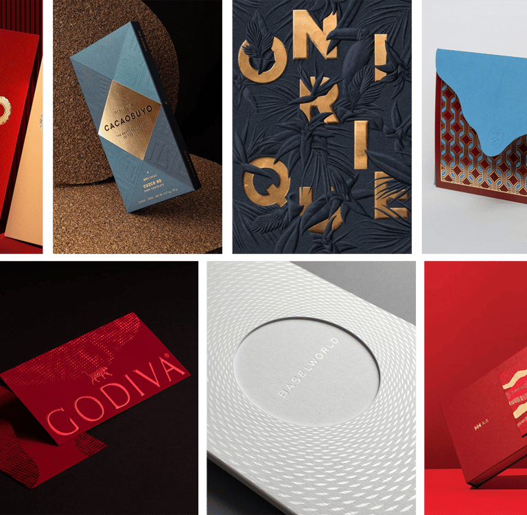
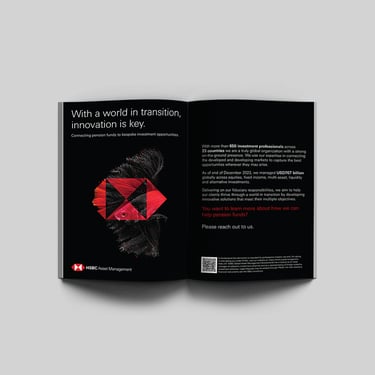
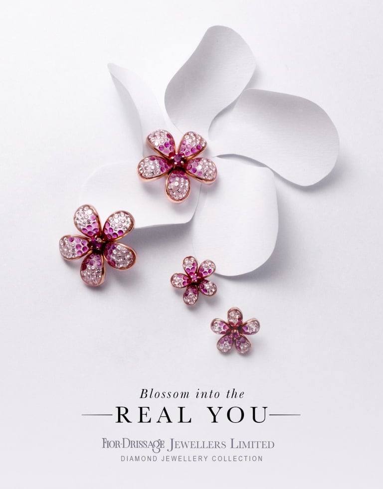
Luxury & Premium Look in Print Design
Clients often describe the persona they want their brand to embody with words like ‘Luxury’ and ‘Premium.’ Yet few truly understand what these terms mean in print design. Luxury and premium print go far beyond gold or silver gradients.
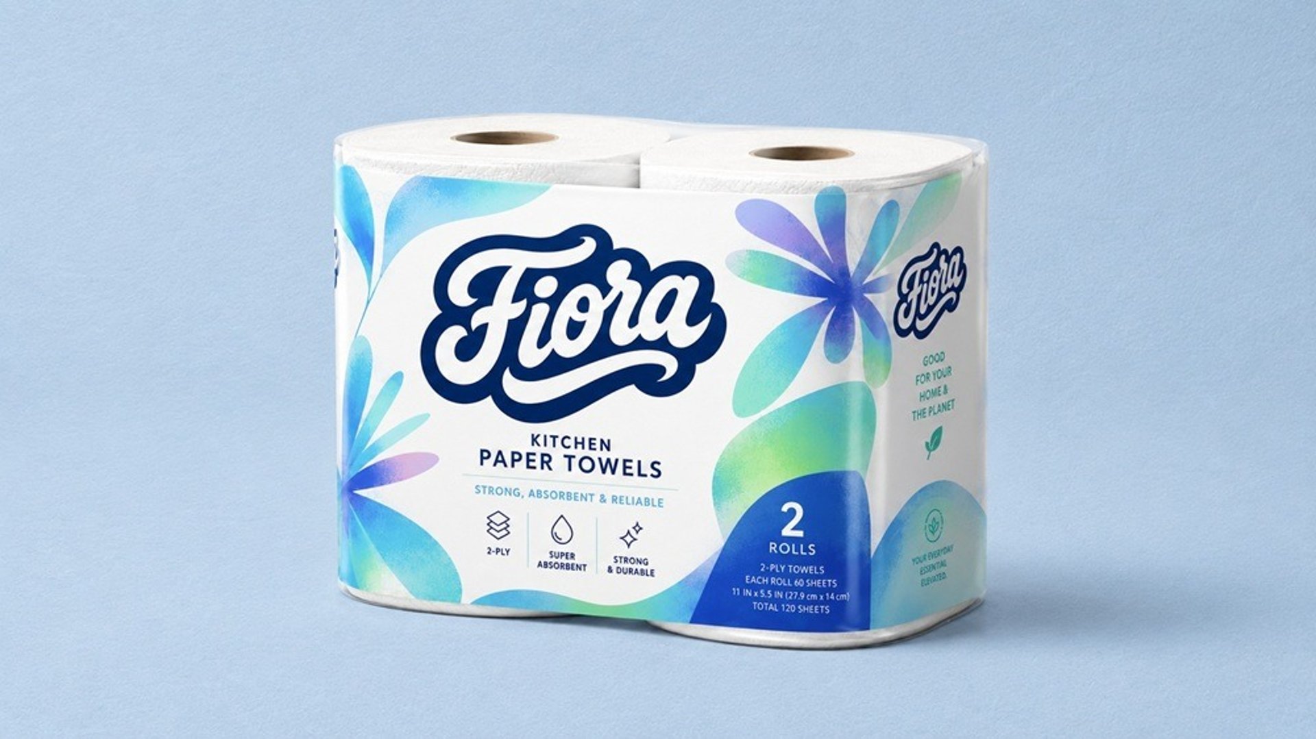
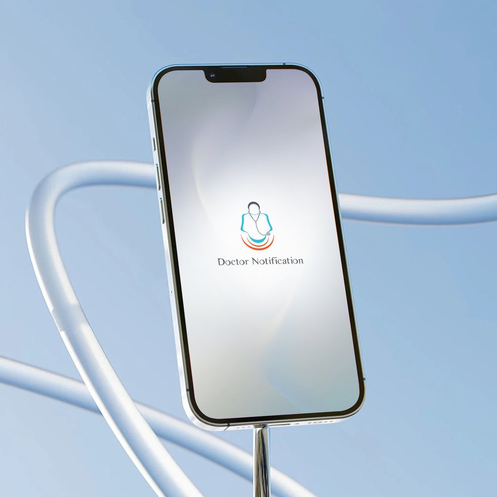
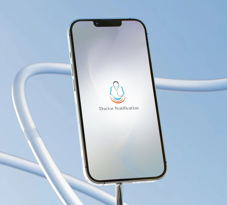
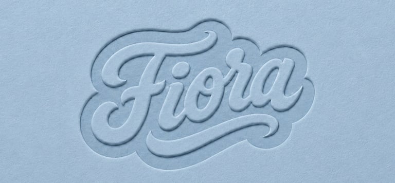
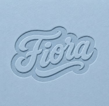
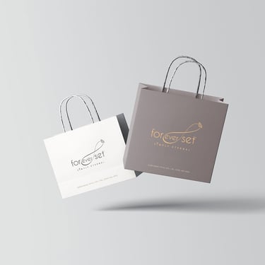
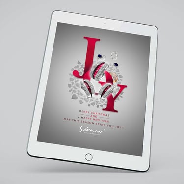
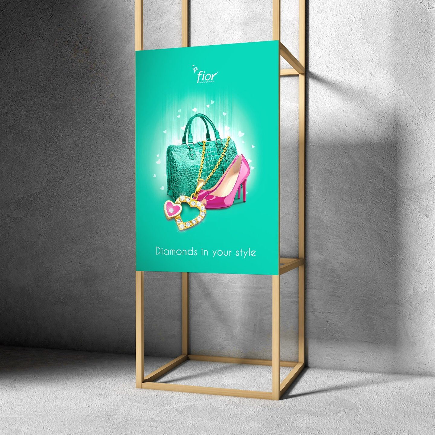
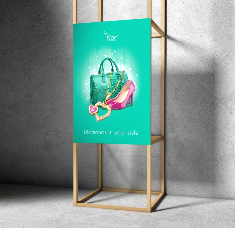
Transforming everyday products into standout brands, this project delivered a complete identity overhaul. From a bold new logo and versatile packaging system to cohesive brand guidelines and advertising assets.
Fiora branding & Packaging Design
NEW BLOG POST
RECENT WORK
By Dona Nirasha
This is an independent practice. One designer. One focus. No handoffs to juniors, no templated shortcuts, and no work begins without a clear, strategic brief.
Open to aligned branding collaborations. Together, let’s build a brand that stands the test of time.
BRANDING,
PRINT & DIGITAL DESIGN
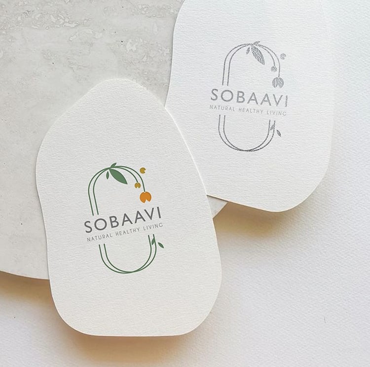
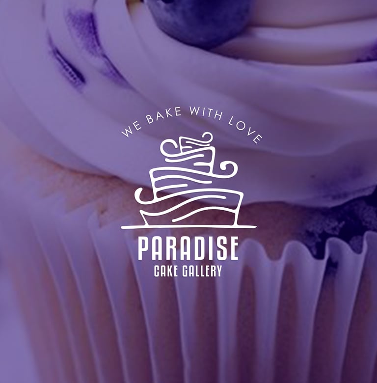
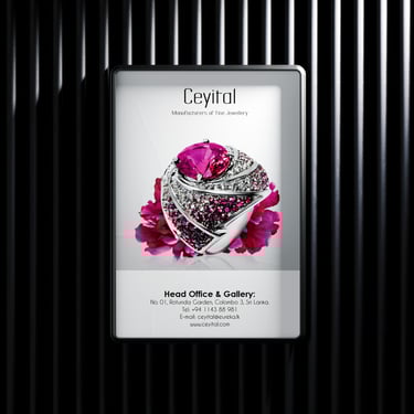
Here are a few design projects I've completed in the past. I specialize in establishing brand identity, creating digital graphics, and producing print materials. My goal is to make sure your brand shines across all platforms. Feel free to visit the 'Services' page to explore the full range of design services I provide.
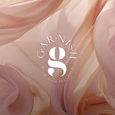
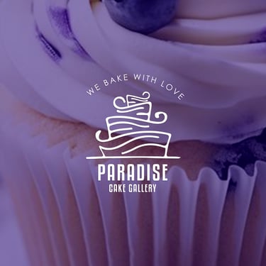
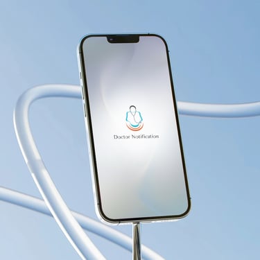
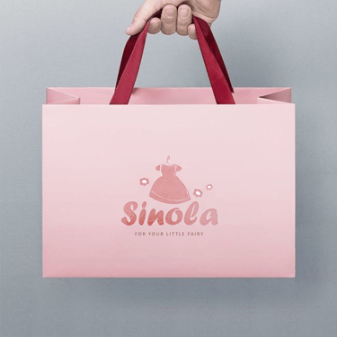
BRANDING,
PRINT & DIGITAL DESIGN
Here are a few design projects I've completed in the past. I specialize in establishing brand identity, creating digital graphics, and producing print materials. My goal is to make sure your brand shines across all platforms. Feel free to visit the 'Services' page to explore the full range of design services I provide.
BRANDING,
print & digital design
Here are a few design projects I've completed in the past. I specialize in establishing brand identity, creating digital graphics, and producing print materials. My goal is to make sure your brand shines across all platforms. Feel free to visit the 'Services' page to explore the full range of design services I provide.
WORK with me
I specialize in enhancing brand engagement through design and photography in meaningful ways. Check the range of services I provide, and feel free to reach out with any questions or project ideas you may have.
I'm here to help!
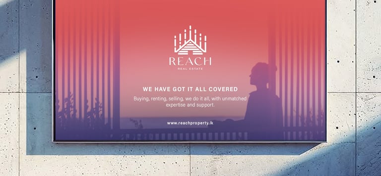
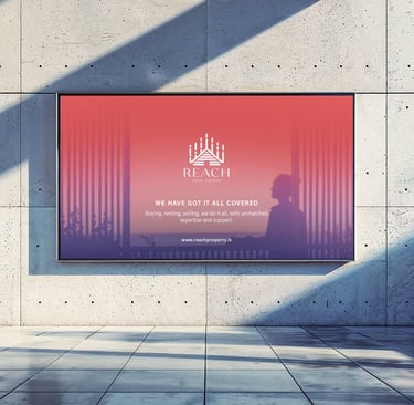
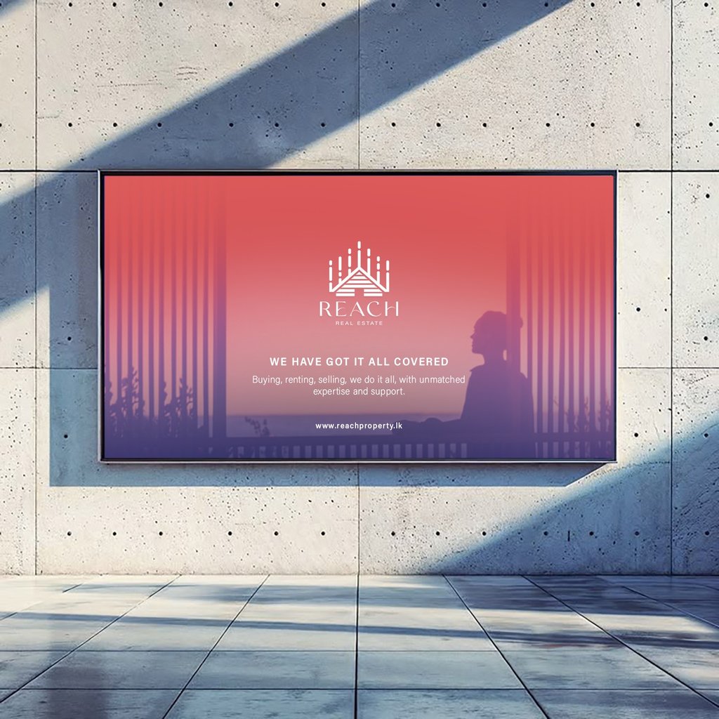
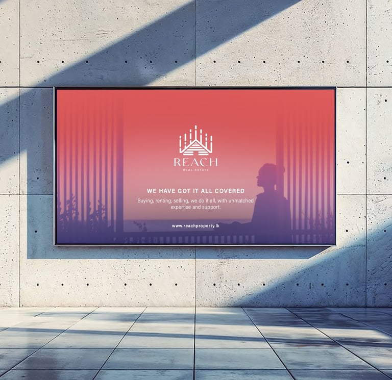
The assignment focused on developing a cohesive brand identity, including a distinctive logo design REACH. This process involved gaining a deep understanding of the company’s values, target audience, and market positioning.
REACH Real Estate branding